
Redesigning how oncologists find clinical trials: from form to conversation
Case Study
Lead Product Designer • Project Duration: November 2025 – February 2026 • Demoed at ASCO GU in February 2026, live April 2026
Overview
Trial Library's Trial Search Platform helps oncologists find relevant interventional trials for their patients and refer them directly to study teams. I inherited the product mid-build in 2023, launched it, then led its redesign as a conversational AI experience, demoed at ASCO GU 2026 and launched in April.
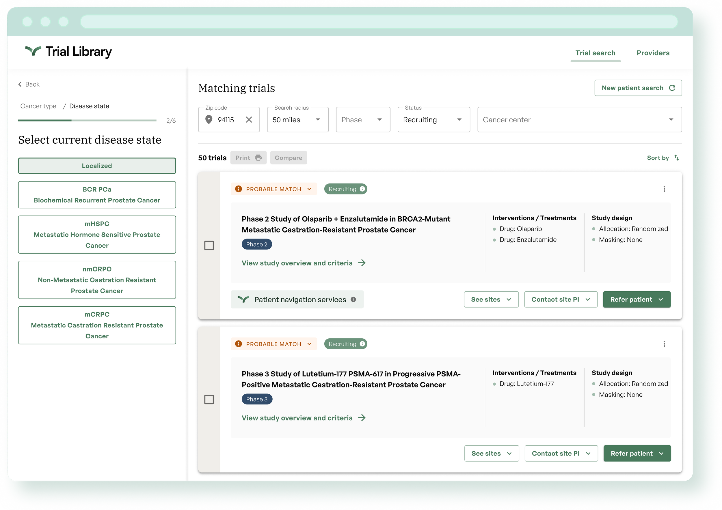
First Trial Search Platform iteration in 2023, questionnaire experience.
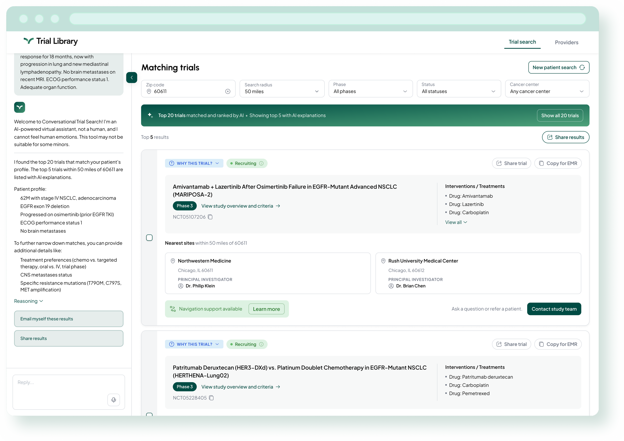
Re-designed conversational experience.
The Problem
The original platform launched as an MVP built without users to test against. It worked, but the data showed a specific failure: providers completed searches, saw results, and left. Referrals to observational studies (via another platform and service) were fine. Interventional trials, the harder to recruit type that matter most to sponsors, were where providers stalled. Essentially no interventional referrals were coming through.
When Series A funding arrived with a directive to embed AI more meaningfully in our products, we also gained access to an oncologist advisory group for the first time. They told us why providers were dropping off: too many trials to dig through, and not enough confidence to refer at point of search.
Role and Constraints
Sole designer, end to end: research, interaction model, interface design, and implementation through QA, partnering closely with our PM. Two constraints shaped the work. The AI directive required interpretation, not just execution: figuring out what AI-first actually meant for a time-pressed oncologist. And we had a fixed demo at ASCO GU 2026, which forced disciplined scoping.
Research
In November 2025, before redesigning anything, I ran a usability study with five oncologists and research operations professionals. Two major findings shaped everything that followed:
Results overload was blocking decisions. With 50+ trials returned, oncologists described needing hours to evaluate options. One participant asked for a ranked shortlist three times in a single session.
Trust was fragile and specific. Participants were not confident in the results displayed after going through the form, and one wrong result was enough to stop users from further taking action on the platform. Participants voiced how they preferred to ask colleagues instead of reading through the results.
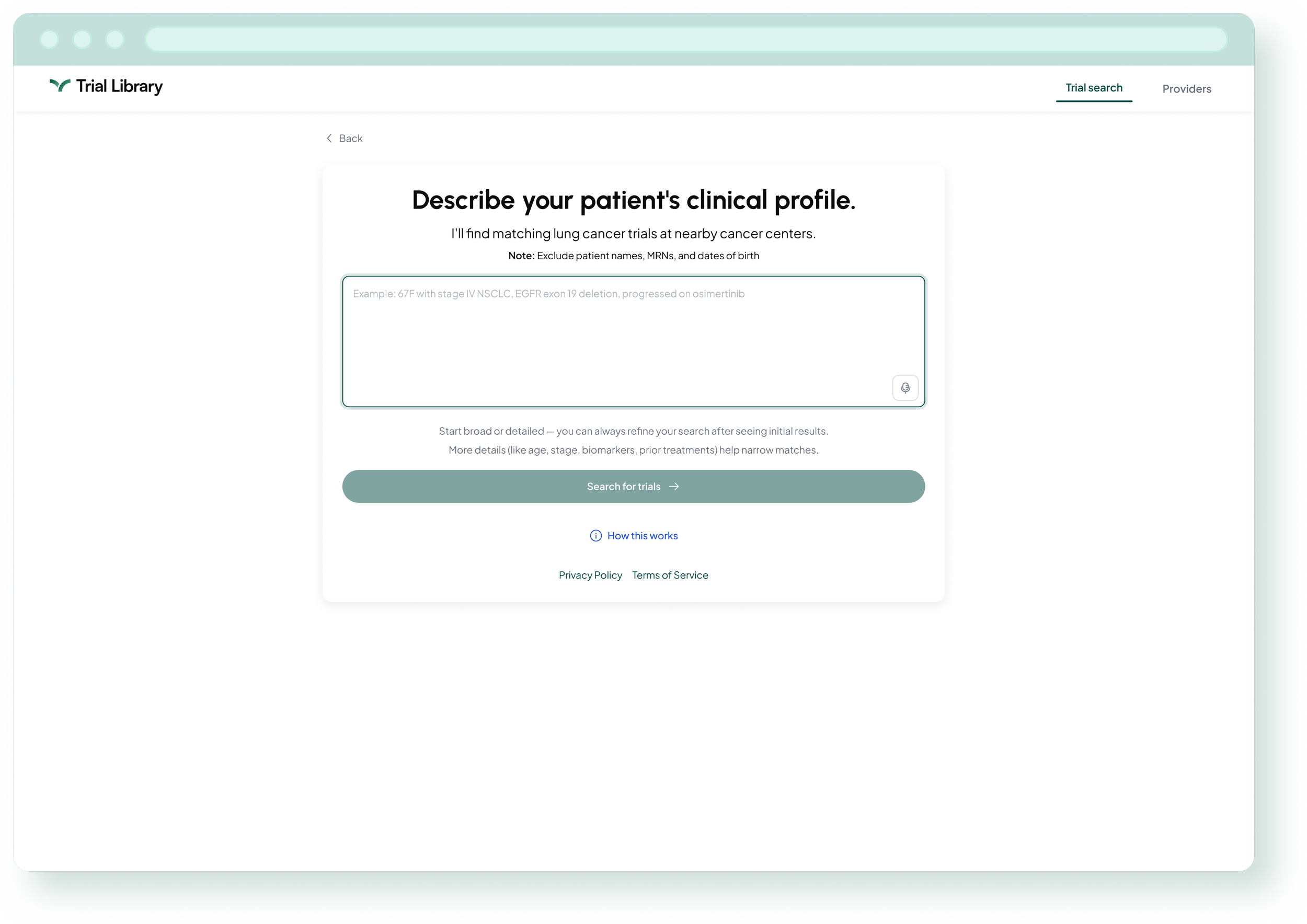
The Scoping Decision
I recommended redesigning the search and input experience only, leaving the trial results layer unchanged. The trial cards, with their comparison, print, and referral actions, were working well and represented significant engineering and operational workflow investment.
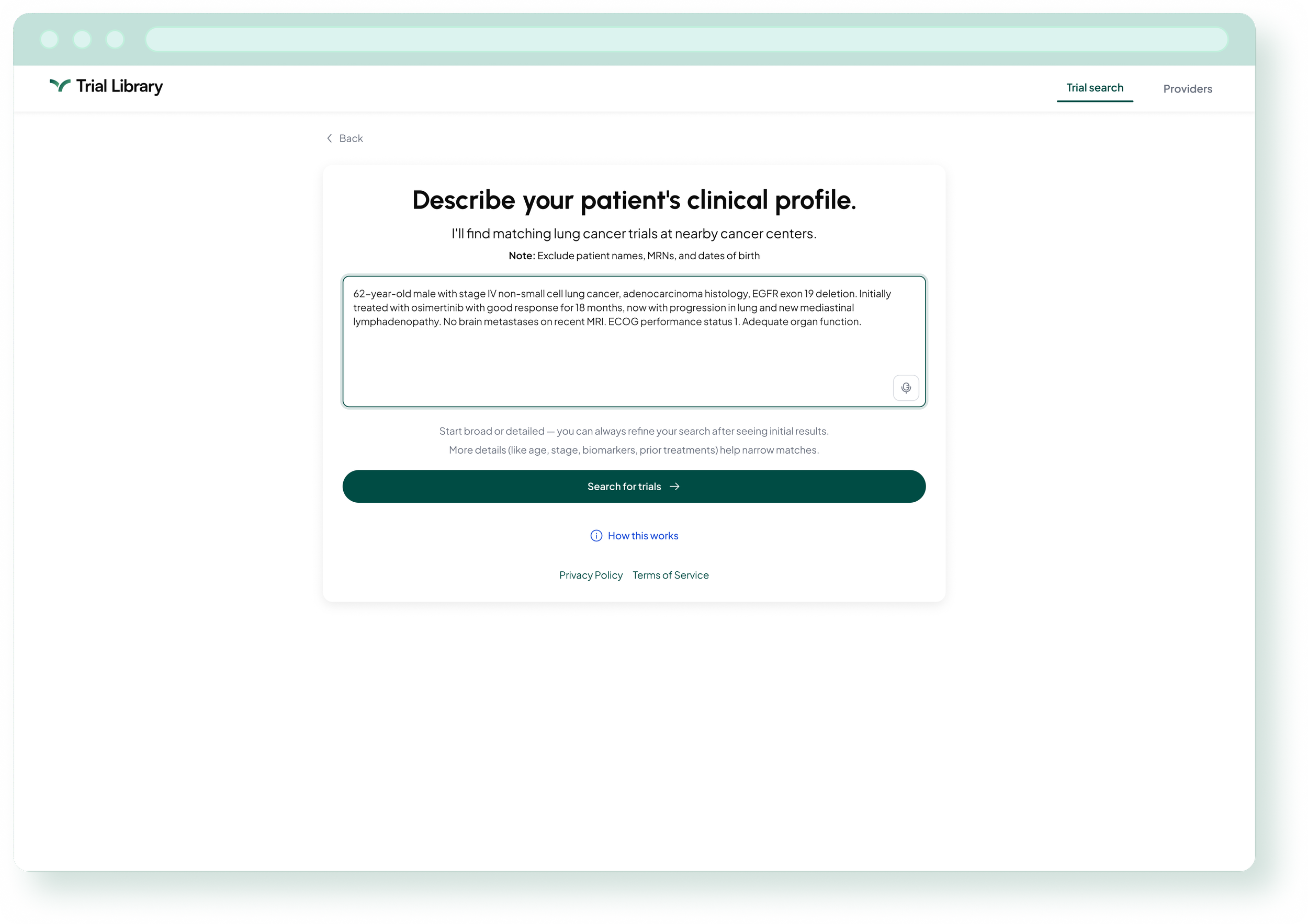
Design Decisions
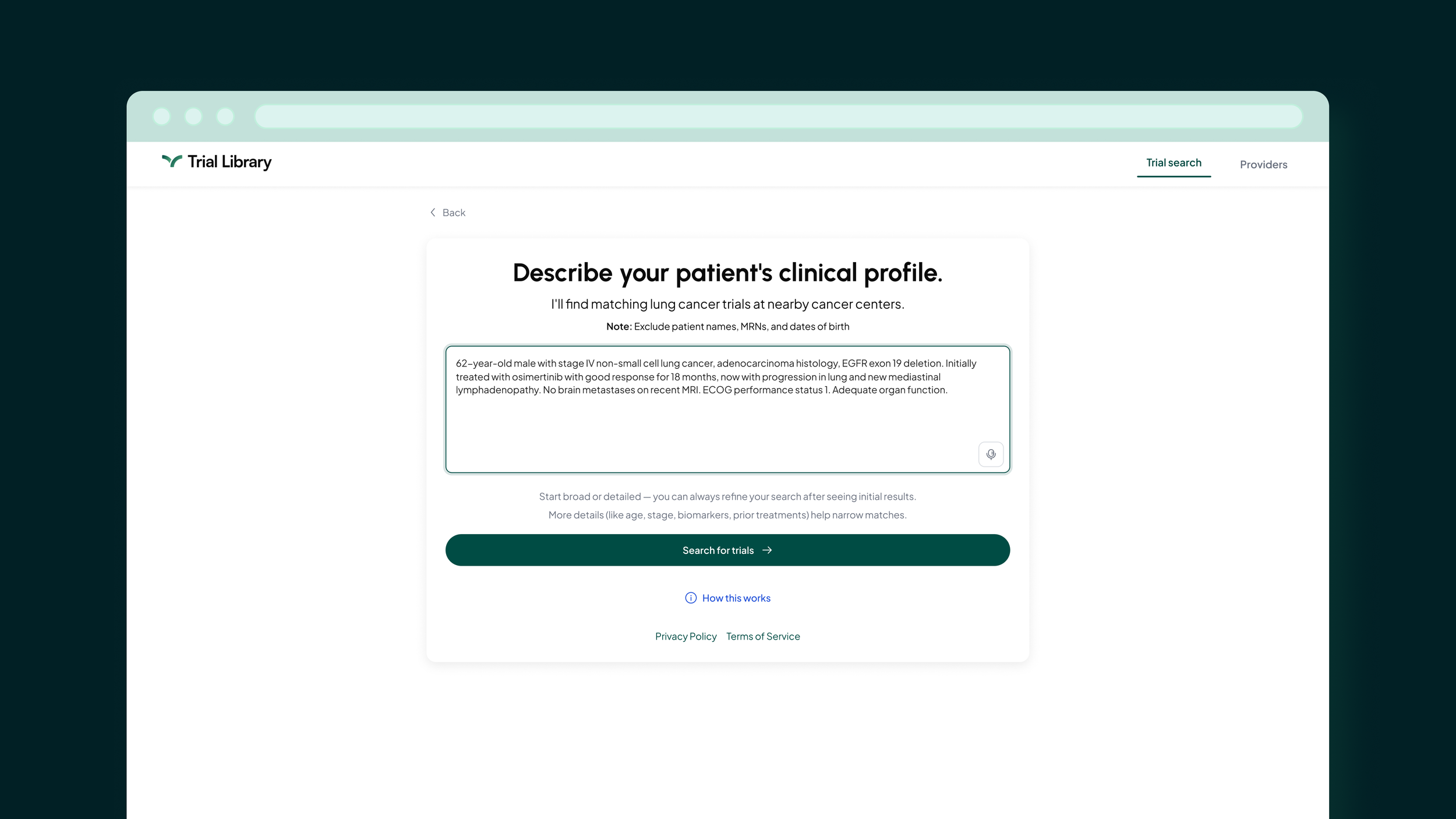
The core question was what "conversational" actually means for a time-pressed clinician. Not open-ended chat, but a single natural language input field that accepts a clinical patient description and returns results immediately, along with follow-up questions to help refine them further. Oncologists could start as broad or as detailed as they wanted. A clinical example in the placeholder text helped guide the interaction, meeting users in the language they already speak.
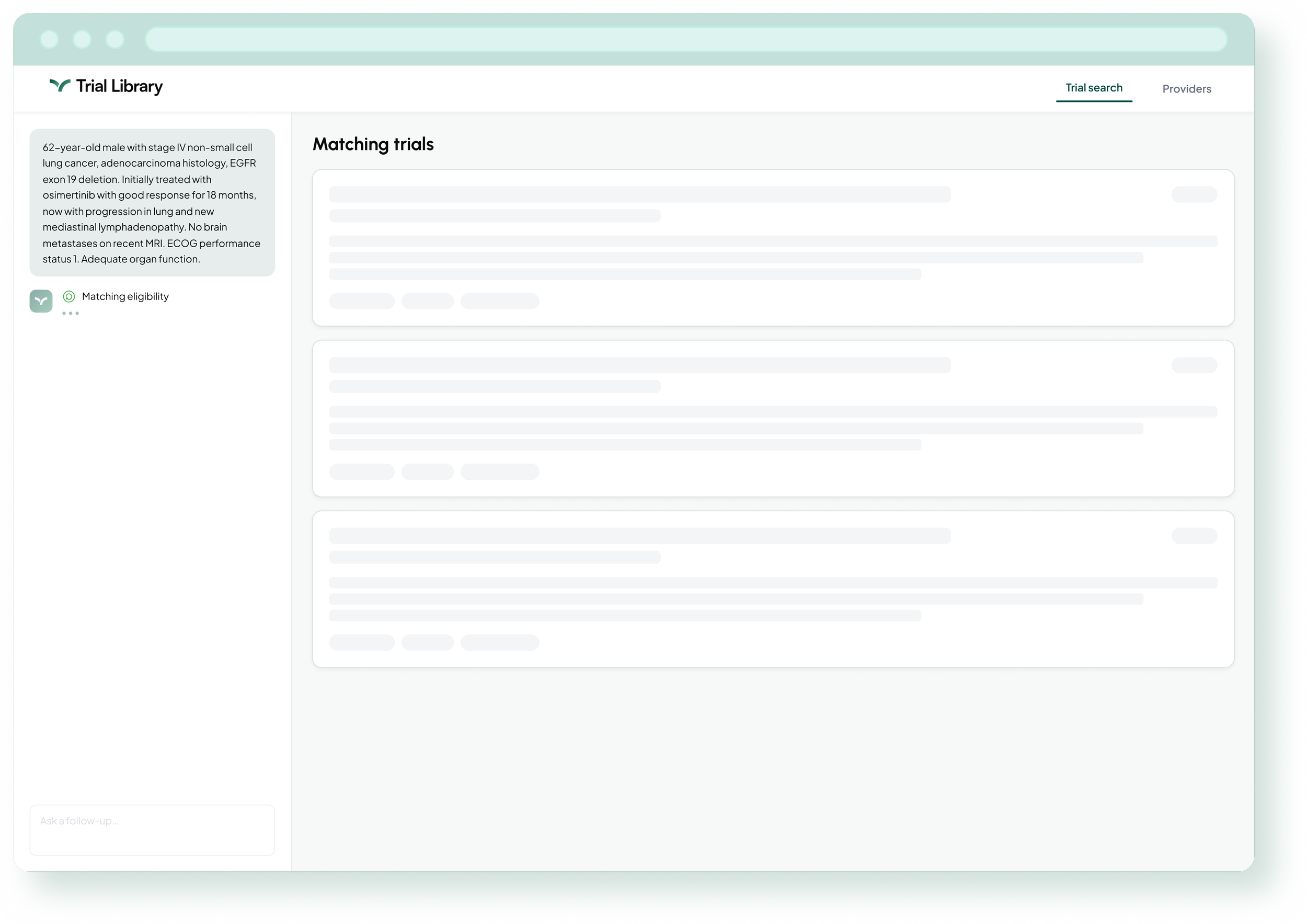
The Thinking State
Between input and results, I designed a progressive thinking state showing the model's processing steps in sequence: matching eligibility, checking location details, ranking results. Research showed zero participants would use the tool during a patient visit, partly because waiting for opaque AI felt uncertain. Making the model's work visible reduced that anxiety and gave oncologists something meaningful to read while results loaded. I provided detailed animation specifications to engineering for how each step should sequence and reveal.
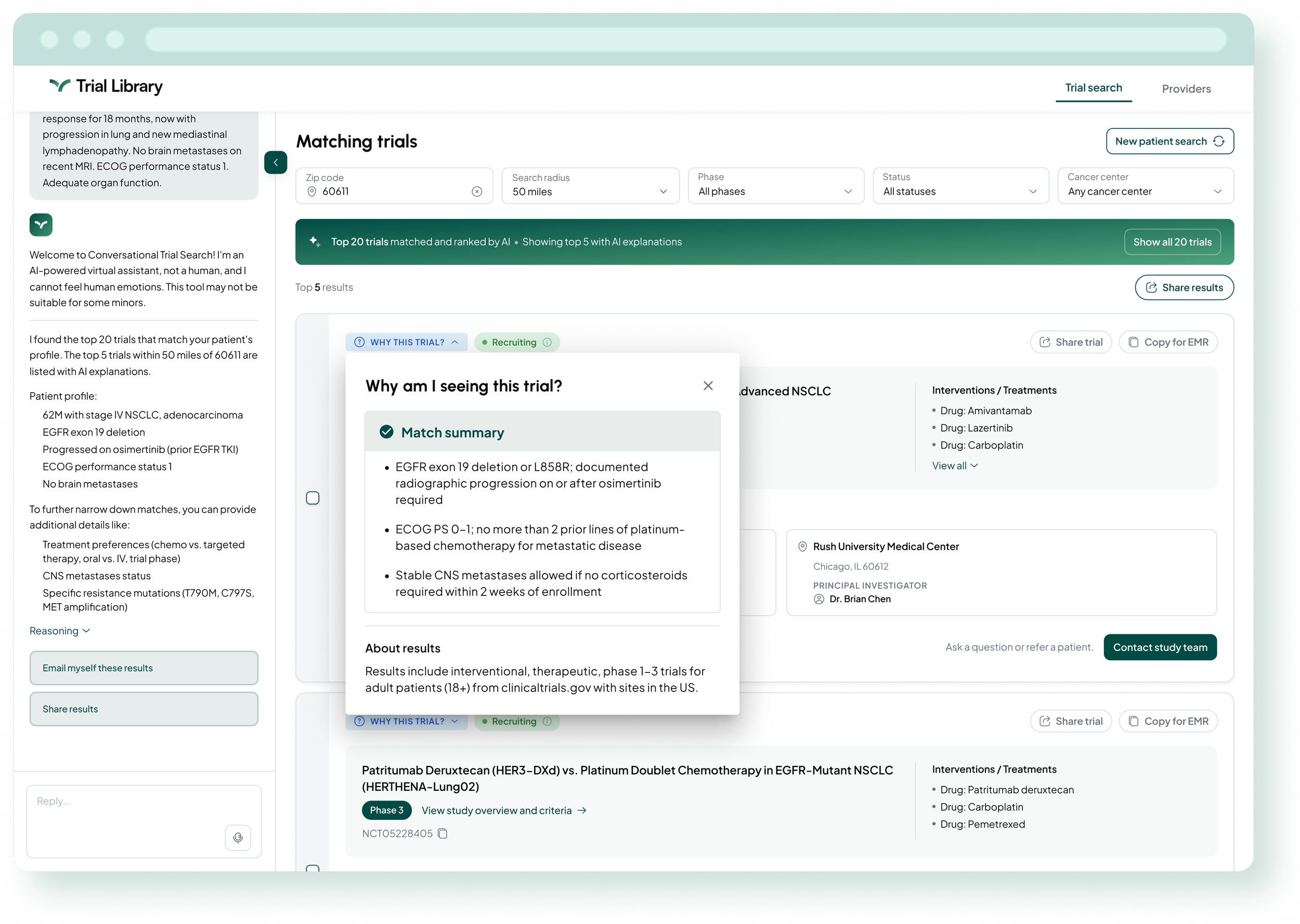
The Response Layer
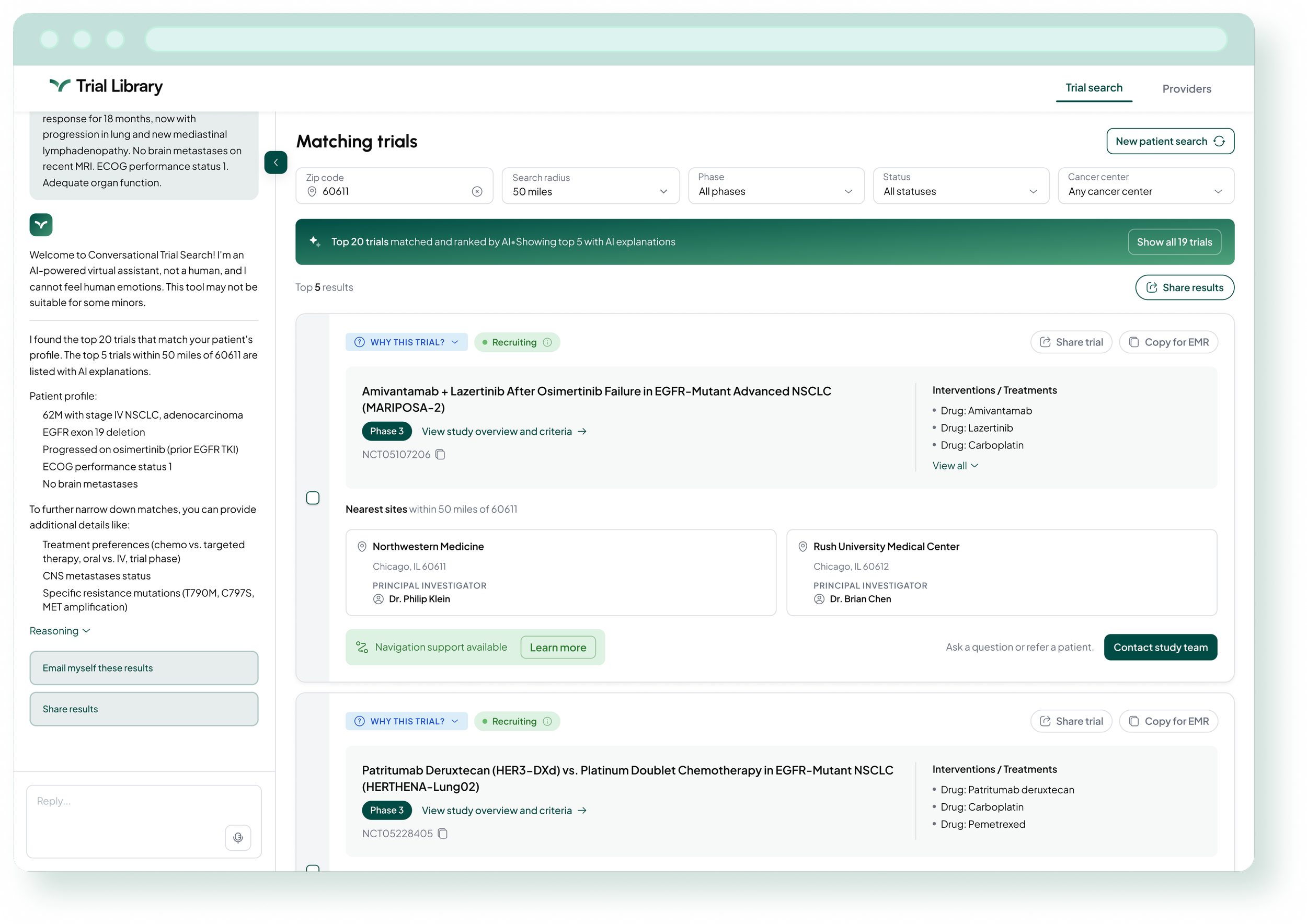
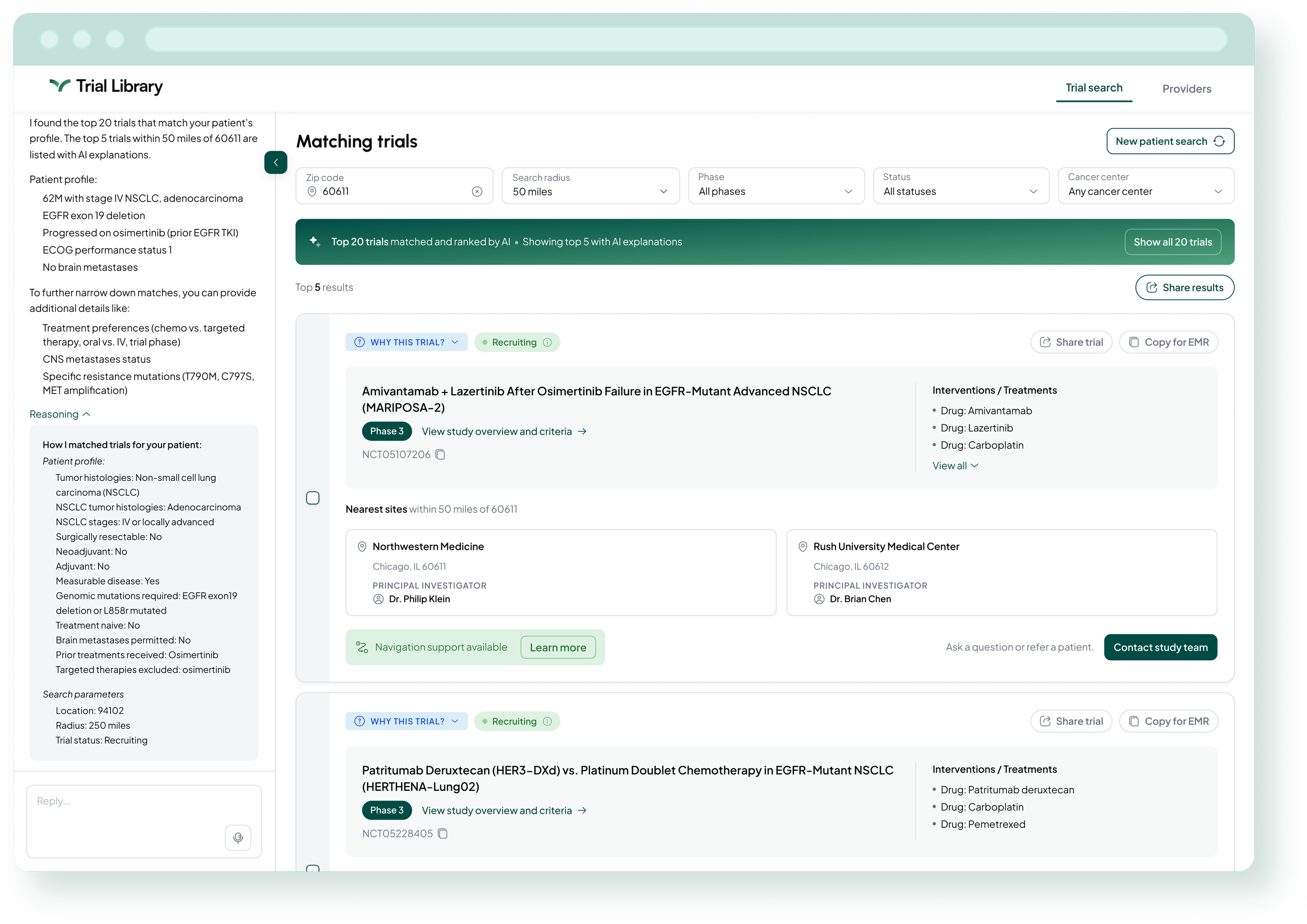
To address results overload directly, the redesigned experience surfaces the top five ranked trials first, with refinement through conversation rather than digging through a long list.
Building Trust
Research showed oncologists would stop using a tool the moment they caught a single inaccurate result. And for interventional trials, referring means proposing a treatment change to a patient, a higher-stakes decision that demands more confidence. Trust had to be designed in.
I built four components working together as a system:
A patient profile summary to verify the model understood the input before results appeared
Numbered clinical questions to help narrow to the most relevant trials without starting over
An expandable Reasoning panel showing the model's matching logic
A "Why this trial" button on each result card explaining exactly why that trial was included.
Engineering's initial build omitted all four. The PM and I advocated through multiple cycles until they were implemented.
Outcome
The funnel moved. Before the redesign, providers abandoned at results and interventional referrals essentially never happened. In the first two months after the April launch, five interventional trial referrals came through the platform, and roughly one in nine searches produced referral intent.
The data also surfaced the next problem: providers who clicked Get Started still dropped off inside the referral form itself. I designed a response that just launched: abandon modals that capture provider contact information and let them send themselves a reminder about their results, so they can return and refer when they are ready. The advisory board told us some providers simply were not ready to refer in the moment. This design meets them there instead of losing them.